Herbalist
Redefining access to medical cannabis through thoughtful, user-centered design.
- Mobile App
- UX Research
- UI Design
My Role
UX/UI Designer, solo end-to-end
Tools
Figma / Zoom / Slack
Methods
Guerilla usability testing / User interviews / Iterative redesign
Overview. Herbalist is a clean, user-first mobile platform built to make medical cannabis accessible and trustworthy, connecting patients with verified care, strain education, and local dispensaries in one place.
The Challenge
Access exists. Clarity doesn't.
Although access to medical cannabis has grown, users still face confusing information, hard-to-navigate platforms, and a lack of trusted resources. Many end up self-medicating without proper guidance, a risky and time-consuming process.
Herbalist was designed to solve this: one platform guiding patients from their first question to a verified prescription, and everything in between.
The Goal
One trusted platform.
Connect patients with the right products, accurate dosages, and reliable information, and give them a clear, accessible pathway to obtaining a medical cannabis prescription with professional support at every step.
Process
What I did
- 01
Recruited participants via Slack and conducted remote guerilla usability testing over Zoom
- 02
Identified critical pain points in navigation, content clarity, and checkout flow
- 03
Ran two full design iterations, from an inaccessible initial concept to a cohesive, accessibility-checked system
- 04
Redesigned key flows based on direct user feedback, tightening visual hierarchy and brand alignment
- 05
Built a mini design system covering typography, color palette, and reusable components
Research
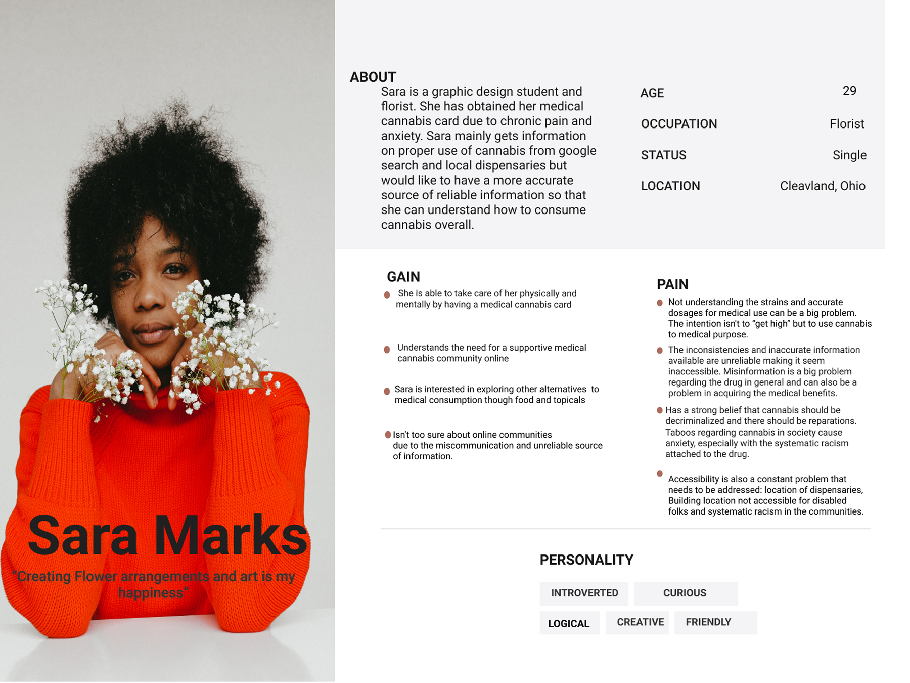
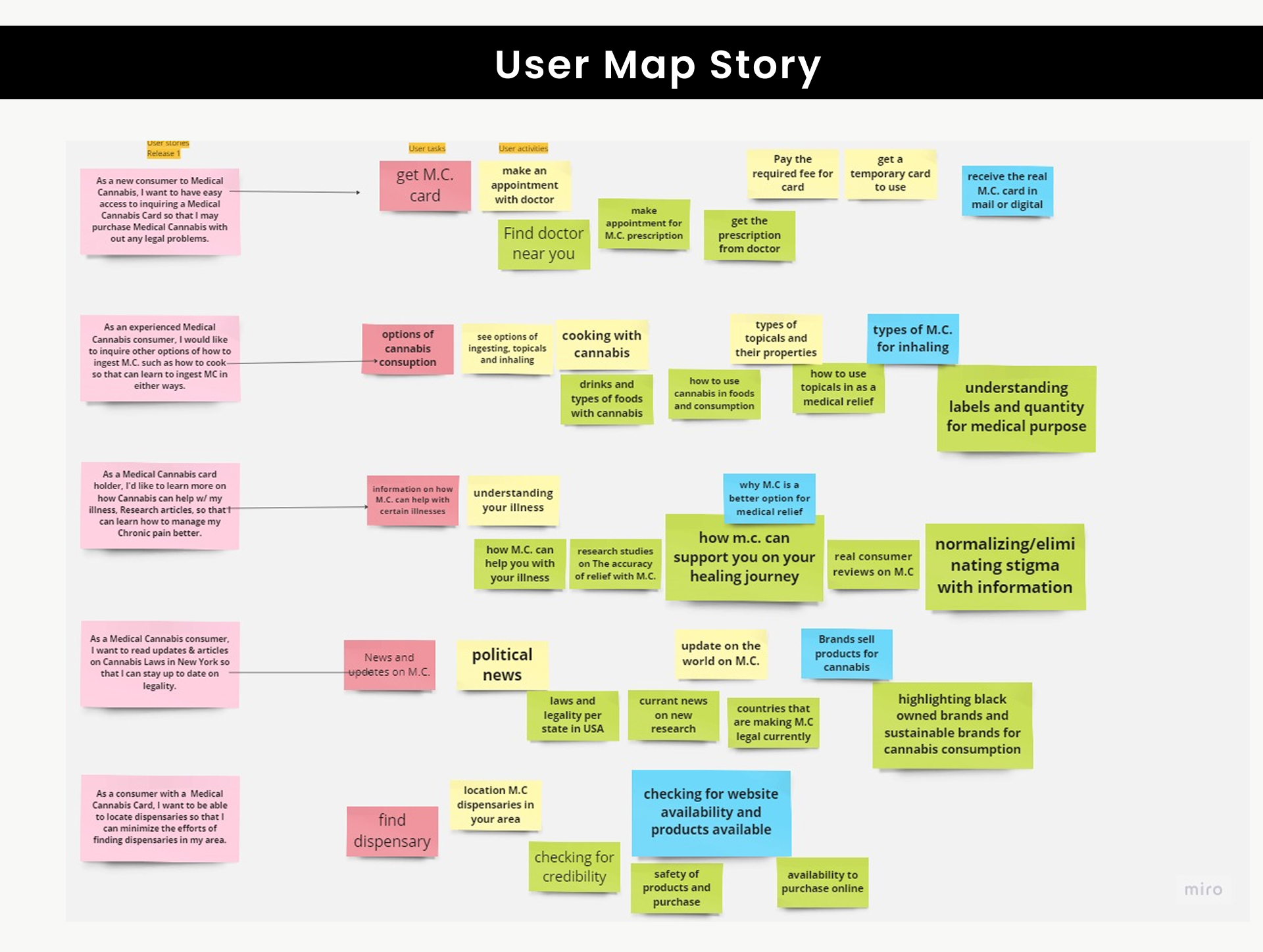
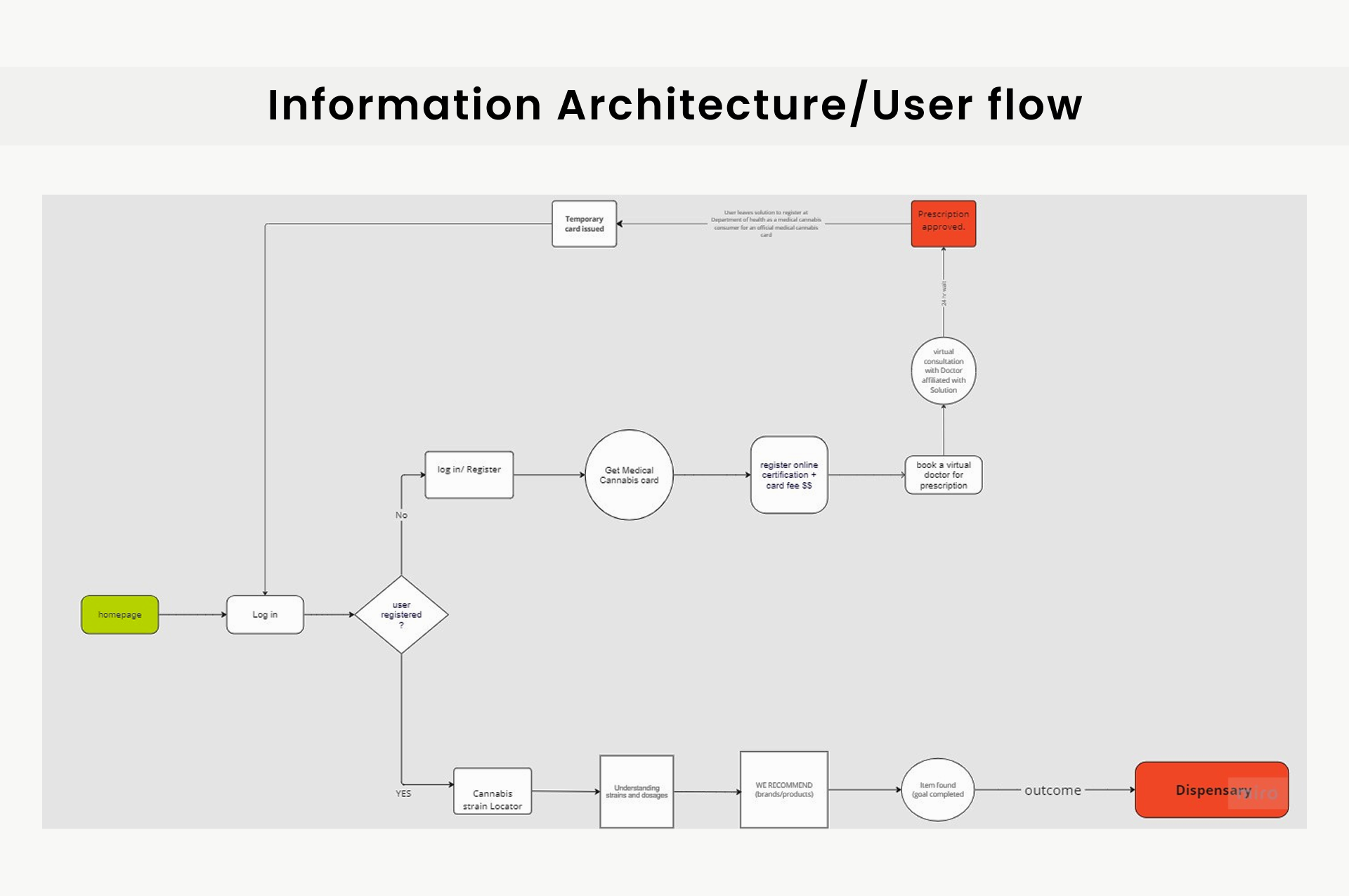
Every design decision was grounded in what users actually say, think, do, and feel, not what we assumed.
Ideation
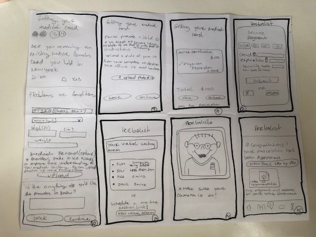
Early sketches
Before moving into Figma, rough sketches established the core prescription approval flow, capturing key moments like the 24-hour approval window and the letter of recommendation state. Lo-fi thinking that shaped the final product.
Usability Testing
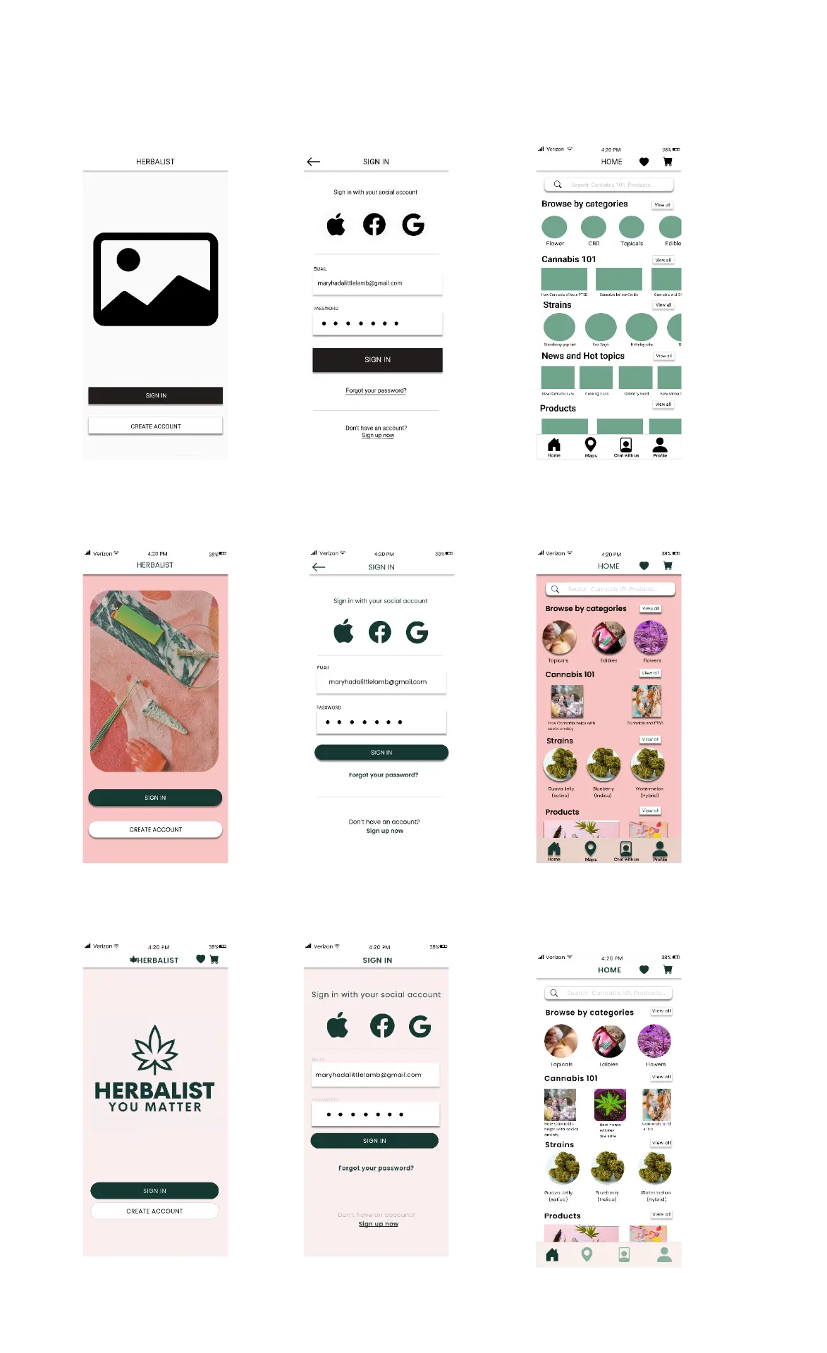
From first draft to final design
The original design had accessibility issues, poor contrast, and visual noise. Each round of testing drove concrete changes, from color contrast alignment to spacing and hierarchy.
Outcomes
Faster Task Completion
Users completed key flows, browsing strains, finding a dispensary, checkout, faster and with fewer errors after the redesign.
Higher Trust & Satisfaction
Post-test feedback showed stronger confidence in the platform, driven by cleaner visual hierarchy and improved accessibility.
Accessible Design System
Color contrast aligned to WCAG standards. A reusable component library makes future iterations faster and more consistent.
What I Delivered
- Final high-fidelity mobile app mockups
- Updated screen flows with usability fixes applied
- Usability testing insights & action plan
- Herbalist mini design system, fonts, colors, components
“Design a simple, user-focused app that meets the needs of today's medical cannabis consumers: clear, accessible, and trustworthy.”
Design Brief, Herbalist