Reimagining a Community Newsletter
Turning a routine communication asset into a product experience for residents, families, and internal teams.
- Editorial Design
- UX Design
- Design Systems
My Role
Editorial Designer, UX Designer
Timeline
2025 – 2026
Client
Senior Living Monthly Community Newsletter
Audience
Residents (65+), families, internal marketing stakeholders
Tools
Canva, PowerPoint
Overview. In early 2025, I took ownership of a monthly community newsletter at Sunrise Senior Living, serving residents, families, and internal teams. What began as a routine communication asset quickly revealed itself as something else: a product embedded in people's daily lives.
The Opportunity
The existing newsletter wasn't failing, but it wasn't working.
Built in PowerPoint, the template was visually outdated, structurally rigid, difficult to update, and overwhelming to read.
Information existed, but it wasn't felt. Dense text blocks, inconsistent hierarchy, and limited visual storytelling made it hard for residents to engage with content that was meant for them.
The opportunity wasn't just to redesign a layout, it was to rethink how the community experienced information each month.
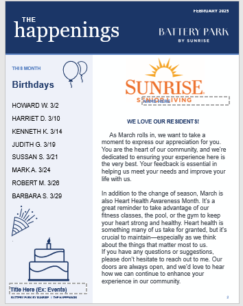
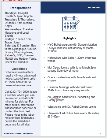
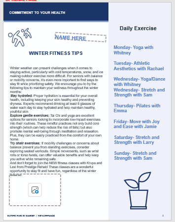
The inherited PowerPoint template: rigid grids, placeholder artwork, and text sized for a screen rather than for residents.
Listening Before Designing
Instead of jumping straight into redesign, I started with conversations.
Through informal, ongoing discussions with residents, I asked: What do you actually read? What do you skip? What would make this feel more like yours?
Patterns quickly emerged: residents didn't want more information. They wanted clarity, familiarity, and connection, they wanted to feel included. They gravitated toward recognizable faces in photos, writing that felt human, not institutional, and layouts that were easy to follow and revisit.
At the same time, internal teams needed a format that supported storytelling and promotion, and a system that could scale month over month.
Designing an Editorial System
I approached the redesign as both a product system and an editorial experience. The goal wasn't just to improve aesthetics, it was to create structure, rhythm, and usability.
Hierarchy
Clear headlines and modular sections to guide attention
Rhythm
Consistent spacing and pacing to reduce cognitive load
Accessibility
Readable typography, strong contrast, and intentional layout flow
Storytelling
Making space for imagery, moments, and community, not just announcements
Continuity
Aligning closely with Sunrise's brand to maintain trust
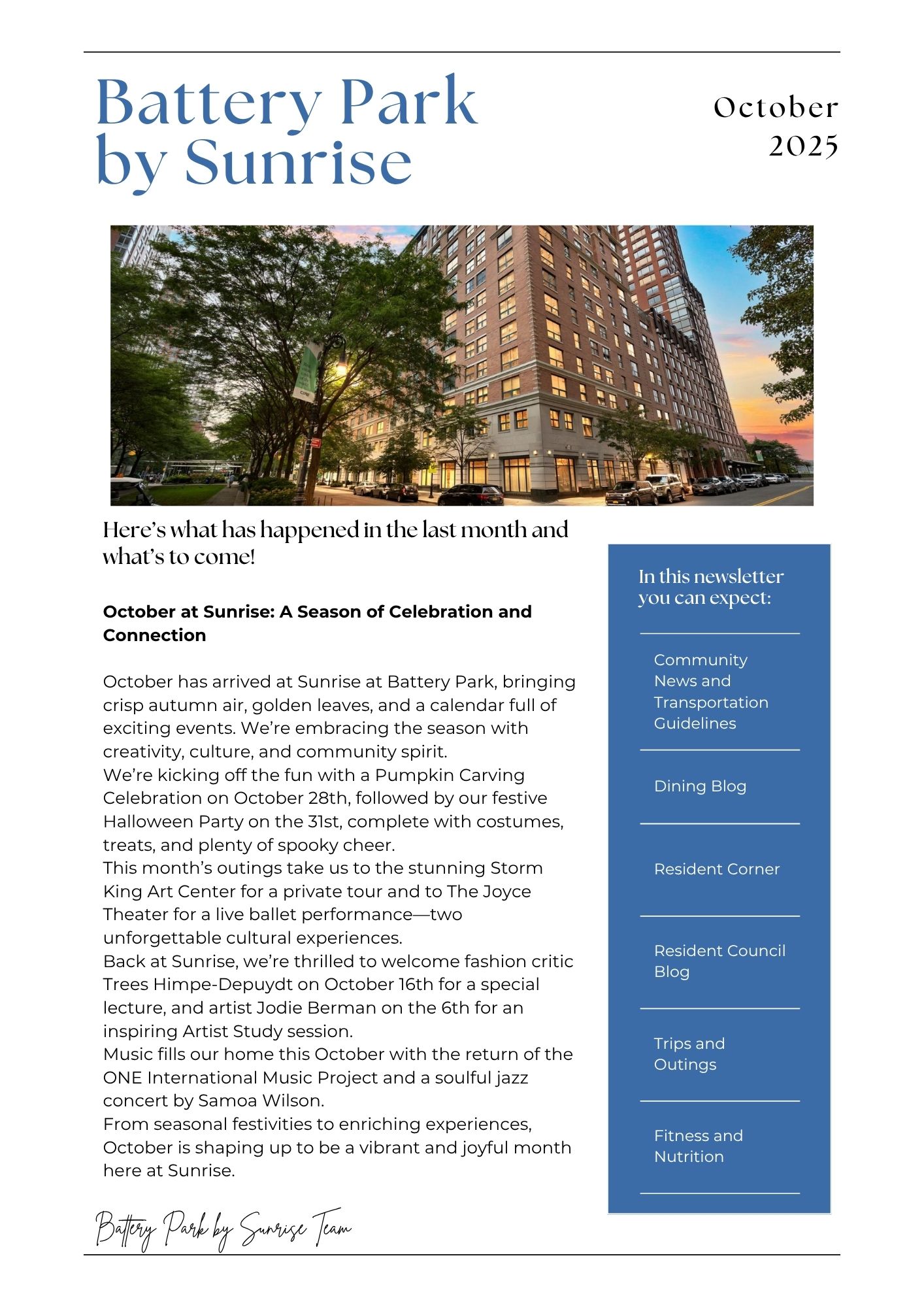
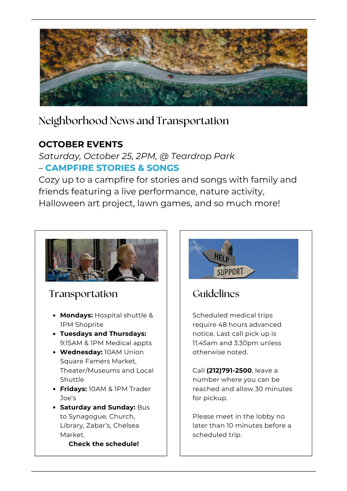
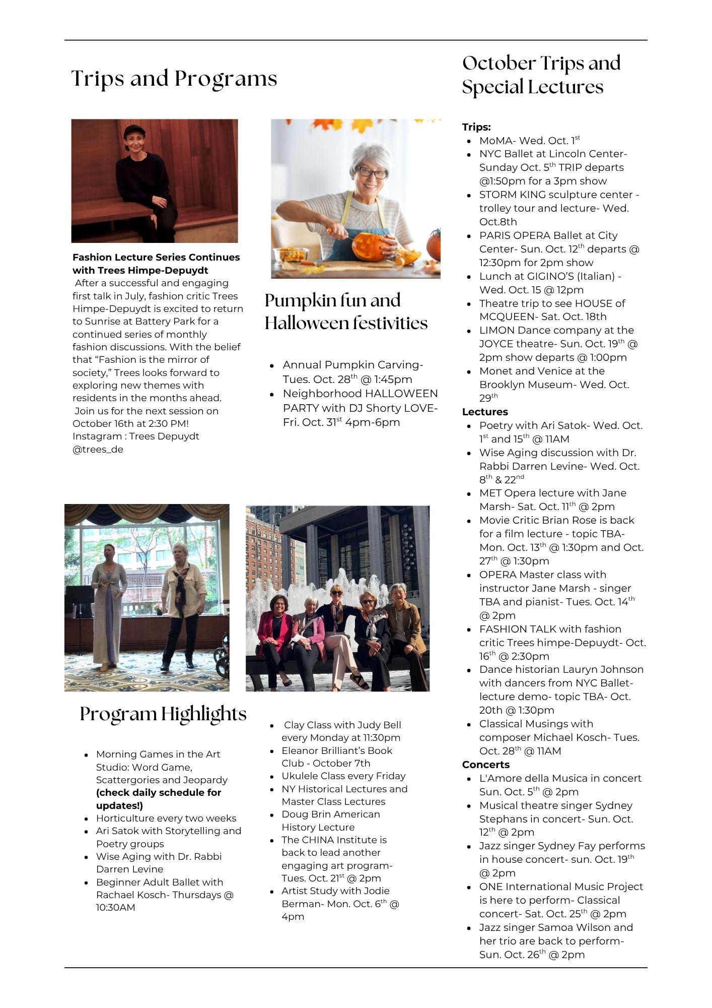
The redesigned system: a clear masthead, modular cards, generous type, and real faces from the community.
Designing Within Reality
Constraints were real. PowerPoint remained the required delivery tool, and multiple stakeholders contributed content each month.
To bridge quality and practicality, I built the design system in Canva: creating a high-fidelity, low-barrier template that could be easily updated, reused consistently, and adapted across content needs.
This became the design foundation, regardless of final format.
Evolution & Influence
Later that year, the building underwent a rebrand, becoming The Capstone. As part of this transition, the marketing team redesigned the newsletter.
While rebuilt in PowerPoint, the new version reflected the same structural logic, the same hierarchy, and the same editorial pacing.
My redesign became a reference point for the new system, demonstrating its ability to scale beyond its original scope.
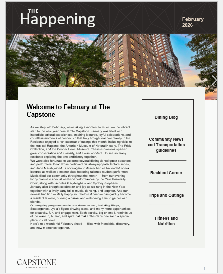
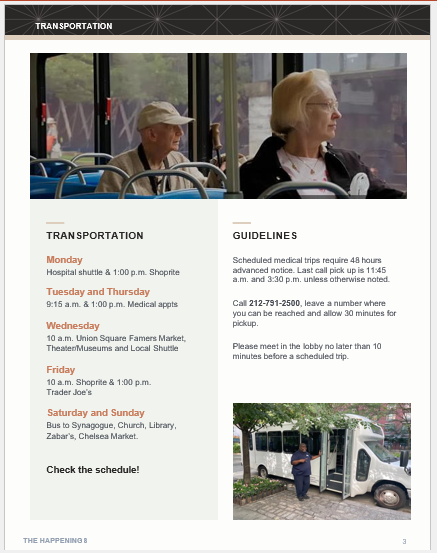
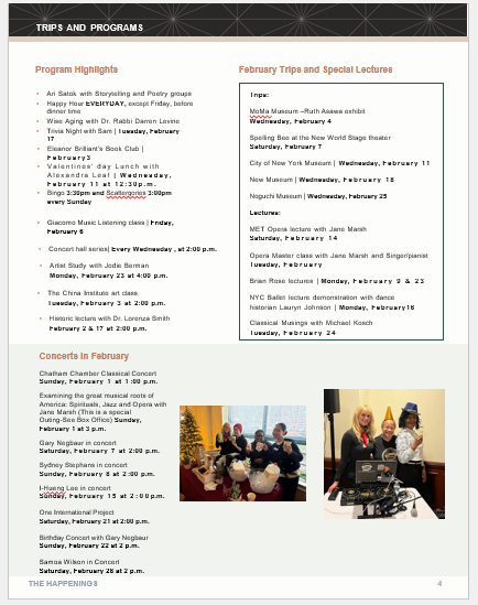
The Capstone rebrand, rebuilt in PowerPoint, carried forward the same hierarchy and editorial pacing.
Key Takeaways
- Designed for real users through direct conversation
- Applied UX principles to print and PDF formats
- Built a scalable editorial system within constraints
- Balanced clarity, accessibility, and warmth
- Influenced future design direction across the organization
Why This Work Matters
This project sits at the intersection of product design, editorial design, and real human experience. It shows how everyday communication can be treated as a product, editorial design can improve usability, not just aesthetics, and systems thinking can influence work beyond direct ownership.